Posted by


João Oliveira may only have been in the Depthcore family for just over a year but his flurry of contributions has quickly solidified his status as a strong staple of the community. Asserting himself as the go-to guy from all things type and glow, the evolution of his style is a display of his promise as an illustrator and typographer. In this workshop we're given the chance to peer over his shoulder to get an insight into how he creates his work.

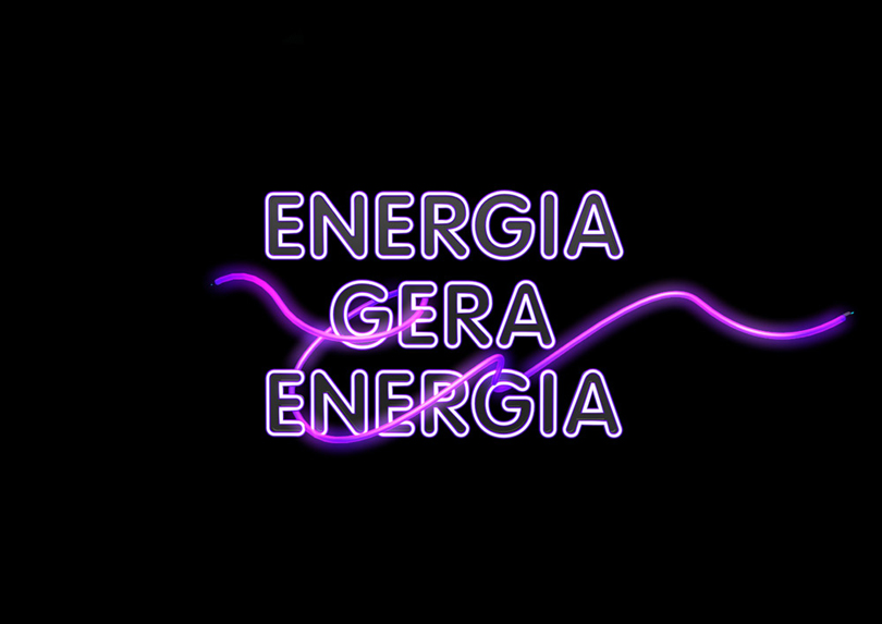
I recently received an email from an agency requesting an illustration for EDP, the Portuguese energy company, to be used in a campaign about renewable energy.
The brief was very clear; my objective was to illustrate the phrase "Energia Gera Energia" (Energy Generates Energy) which referenced water based methods of generating energy. As I result I intended to create a powerful, extremely busy and detailed illustrations with lots of energy, movement complimented with light and water elements.
This worked out well as my style of illustrations aligned fittingly with the aesthetic requested by the agency. The illustration flowed well and resulted in an explosion of energy, wanter, neons, jelly fish and music.
In this case study I'll briefly explain the creative process behind this project: